Journeys
Set Designer, Peter England, discusses the creative vision behind his Bangarra set designs
First meeting Stephen Page in 1995, Peter England discusses the creative drivers behind his award-winning designs.
First meeting Stephen Page in 1995, Peter England discusses the creative drivers behind his award-winning designs.
"... the distortion of thick glass and circular shapes filled with liquid. The whole demise of Mathinna was really tragic."
1995 was my first year out of NIDA - National Institute of Dramatic Art. I was invited by Ric Birch to be part of a team to pitch for a segment in the 1996 Olympic Closing Ceremony, for the handover of the flag to Sydney. He was putting together a team of designers. It would be led by the head of the design school at NIDA, Peter Cooke, and Stephen Page was going to direct it.
We were successful in getting the gig and I met with Stephen and started trying to bring to life this seven-minute segment. We had a year to do that. I just got on with Stephen straight away, on a very simple personal level.
There was a lot of content in the ceremony that we just had to deal with. The final product did its job. It got the international and national attention it was after. It all went great. However, for Stephen and me it was just the beginning of a what if process.
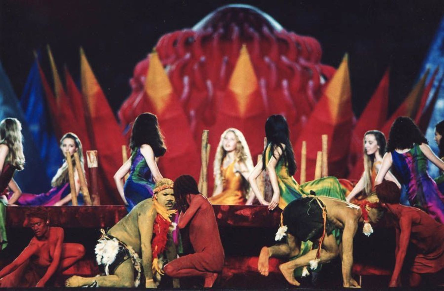
Four years later, we did a significant section of the Sydney Olympic Opening Ceremony that was what we had always talked about. I have a lot of respect and admiration for Ric Birch but I also feel that the version of Indigenous culture presented in Atlanta was the souvenir version, the tea towel version. What we got in Sydney had heart and soul.
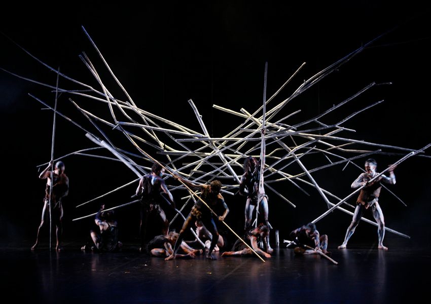
I’ve always felt that the works by Bangarra can be divided into two groups. The ancient, nature based work and then the more contemporary, urban based work. Bush definitely fits into the ancient landscape work.
What Bangarra does is an extremely unique style of theatre. I find it really difficult to articulate, but there's an unrelenting and unapologetic charge to Bangarra’s theatre making. On the one hand, it can be hypnotically seductive but on the other hand it can be brutally disarming because of its, not childish simplicity but extreme simplicity.
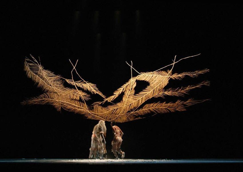
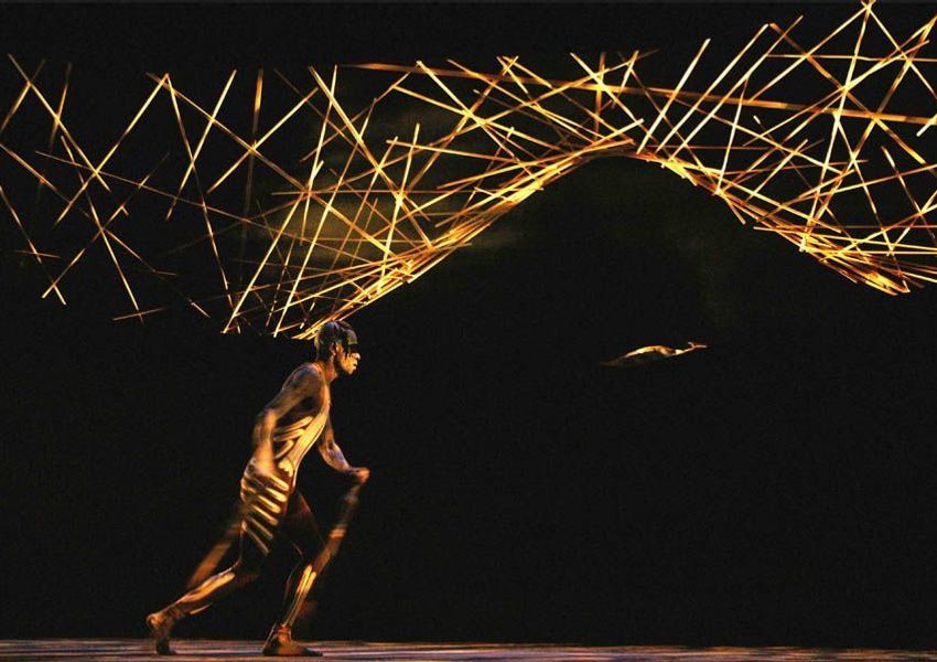
Like in the section called ‘Feather’, it revealed this visual set piece with these kooky, organic-looking feathery lines. You can’t tell whether it's floating, whether it's projected, whether it's painted, whether it's three dimensional. On the one hand, it's verging on Play School in its simplicity but the sophistication of the emotion, it's birth-mother stuff. It's generational. It's ancestry. It's hope. It's fragility. It's fertility. It's comfort. It's home. But it’s also extreme simplicity.
To me Bush was one of the best. It just encapsulated all the things we strove for. It was succinct. It was also poetically ambivalent.
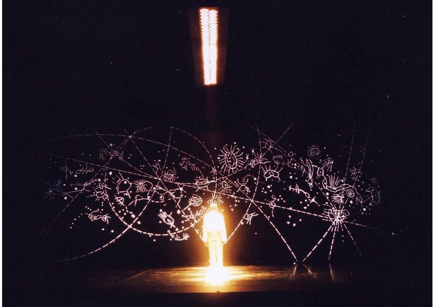
Any work I've done with Fran, she turns up with folders of research. She has gone to the Mitchell Library, she has gone to Adelaide, she has gone to the people who know, in this case, about David Unaipon. When that first happened I was a little bit nervous, and I wasn't expecting it because Fran's personality didn't seem like that. Sure enough it wasn't. What it was, was a rigorous point of departure.
The idea was to depict the two worlds that Unaipon travelled between. From the Indigenous to the Western. From Christianity to traditional spirituality. Between religion and science.
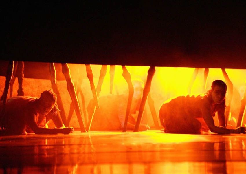
We tried to divide the stage into two halves, both black spaces of emptiness. On the floor down the middle there was a strip of bright white. On the ceiling was another horizontal panel of extremely bright aircraft lights. There was a dynamic choreographic tension around that line.
There was one big ensemble piece where we had probably 12 lengths of thin white elastic that the dancers pulled across the stage, crossing that line. When they danced with those elastics they created these gigantic cat's cradles with their bodies. There was an extraordinary geometric and yet organic quality to it. It was mesmerising the way these shapes were born and the way the dancers moved with it.
It expressed Unaipon's ambitions of bridging two worlds. Whether any of the audience ever got that I don't know… but for what Fran and I first talked about, it completely nailed it.
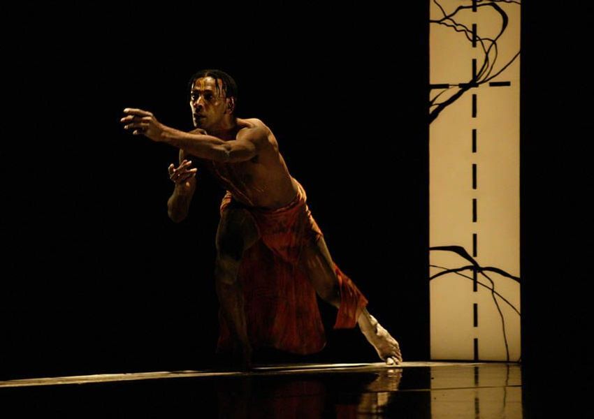
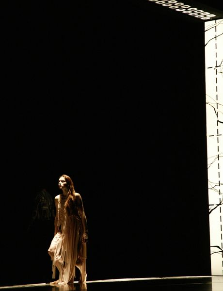
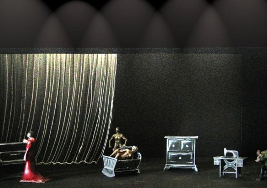
Stephen walked in and said, "I want to do a story about Mathinna." I thought, “Wait a minute. Is that Fran dressed up as Stephen there?” I was really surprised.
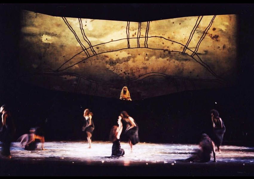
The idea was that we render the stage like the child Mathinna is drawing the story for us, so it's her recollections. It's simplistic in that way, graphically, but it's also simplistic in its content. You're distilling it down to these essential ingredients.
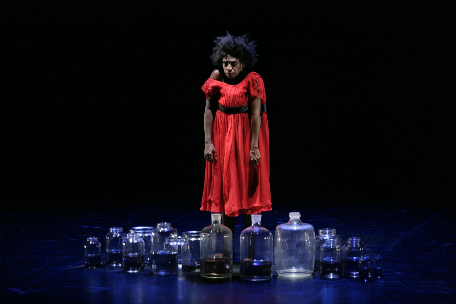
There was a piano built as a regular piano but it was completely black with all its edges described in white chalk, like a kid’s drawing of a piano. It has a childishness to it. There was a red dress that she wore and Jenny did her usual magic. Nothing unique about that kind of palette but it was a simple, strong visual style.
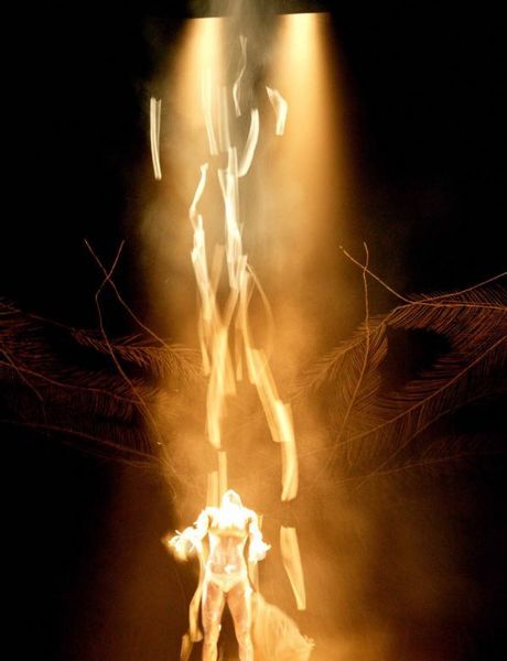
Her final passing was drowning. We had whole lot of large old glass bottles, probably about twenty-five of them. They were all full of water, lined across the front of the stage. Mathinna, played by Elma, lay down behind these bottles. They could have been alcohol bottles, medicinal bottles, specimen bottles. Obviously the red dress she wore just popped through that, through the distortion of thick glass and circular shapes filled with liquid. The whole demise of Mathinna was really tragic. How do you do death nicely? I thought as an image, it had a poetry to it.
Mathinna was different for me and Stephen, perhaps more than anything else. But it was just as rewarding.
"there's an unrelenting and unapologetic charge to Bangarra’s theatre making."
Interview with Peter England
Article by Maura Edmond
Peter England is an award-winning Set Designer. Peter has designed for numerous Bangarra Dance Theatre productions including Fire - A Retrospective, Mathinna, and Boomerang.
Explore profile